Last updated on
Dive into this comprehensive guide because selecting the right interior paint colors can rejuvenate your old house, infusing a blend of history and modern vibe.
Key takeaways:
- Research historical records and consult experts for authentic colors.
- Analyze existing elements to uncover original colors.
- Consider modern technology to capture spirit of historic colors.
- Balance historical accuracy with functionality of modern living spaces.
- Follow local historic preservation guidelines for color selection.
Understanding Period Authenticity
Restoring an old home’s interior to its former glory hinges on aligning with the design ethos of the era. Embracing period authenticity involves a keen eye for detail and a deep respect for the historical narrative each color represents. Here’s how to encapsulate the true essence of the time:
1. Research and Documentation: Dive into historical records, original paint catalogs, and architectural digests specific to the house’s era to uncover authentic colors and combinations used during the period.
2. Analyze Existing Elements: Investigate any remaining original paint through a color analysis, which can reveal the hues that once adorned the walls, providing direct insight into the property’s color history.
3. Consult Heritage Specialists: Professionals with expertise in historical preservation can offer guidance on appropriate color selections, ensuring both accuracy and aesthetic appeal.
4. Color Technology Evolution: Acknowledge that historic color palettes were limited by the pigments available at the time. Utilizing modern equivalents that capture the spirit and vibrancy of original colors can honor tradition while benefiting from today’s higher-quality paints.
5. Balance Function with History: Recognize that while certain shades were predominant in the past, light quality and function of rooms have evolved. Ensure color choices both reflect the era and create a livable space.
By honoring these principles, the art of picking paint colors becomes a tribute to an old house’s storied past, weaving historical accuracy into every brushstroke.
Selecting Paint Colors for Georgian, Federal, and Early Colonial Homes
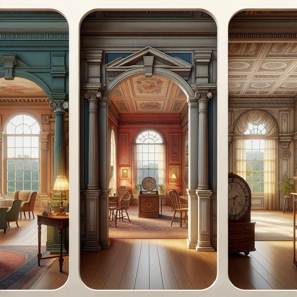
When choosing hues for Georgian, Federal, and Early Colonial interiors, focus on a palette derived from natural pigments available during the era. This typically includes soft muted tones and rich, earthy colors. Light blues, sage greens, and warm grays capture the understated elegance of Georgian spaces. For Federal homes, consider using brighter whites for trim and molding to contrast with gentle blues and greens, reflecting the influence of neoclassicism.
In these periods, paint finishes were not high gloss but had a soft, matte appearance. Milk paint and distemper were commonly used, providing walls with a depth of color and a chalky finish that is distinct from modern latex paints. To accurately reproduce this historical aesthetic, homeowners may opt for flat or eggshell finishes. Always sample colors in different lighting conditions, as these natural hues can change dramatically depending on light exposure.
In addition, woodwork and architectural details in these homes were often painted rather than stained. Whites and creams were favored for woodwork to highlight the craftsmanship. Lastly, when selecting colors, consider consulting historic color charts or period-specific reproductions to ensure authenticity while making choices that reflect your personal style.
Guidelines for Choosing Victorian Era Paint Colors
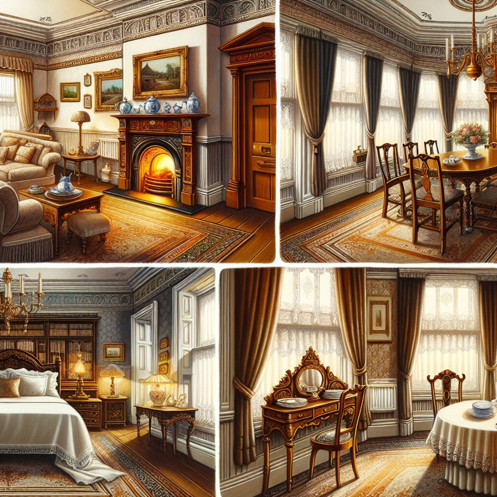
Embrace rich, vibrant hues, a hallmark of the Victorian era, where deep reds, greens, and golds were favored to showcase opulence and comfort. Celebrate ornate details with contrasting colors, emphasizing intricate woodwork and moldings prevalent in Victorian homes.
Consider using warmer tones in social spaces like parlors and dining rooms to create an inviting atmosphere, while bedrooms may benefit from softer, more restful colors.
Integrate historical authenticity by consulting a Victorian-era color chart, often available at paint stores or museums, to choose shades true to the period. For a cohesive look, use historically accurate wallpaper patterns alongside paint colors, reflecting the love for pattern and texture during Victorian times.
Lastly, always test paint colors in different lighting and times of day to ensure they convey the desired effect in your specific interior space.
Selecting Paints for Craftsman Style Interiors
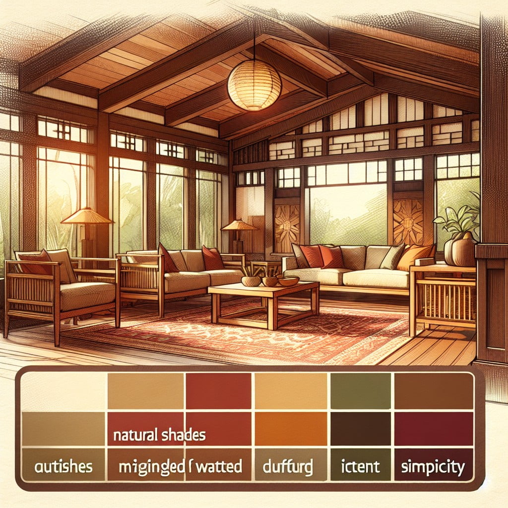
Craftsman style interiors are synonymous with warmth and natural harmony, drawing inspiration from the outdoors and emphasizing organic colors. To recreate the Craftsman aesthetic, focus on rich, muted tones that echo the natural world. Earthy browns, deep greens, and warm ochres are quintessential. Incorporate subdued blues and soft grays to reflect the skies and distant mountains, providing a calming backdrop to the bolder, earth-toned accents.
When considering woodwork, which is a prominent feature of Craftsman architecture, opt for stains that let the wood’s natural beauty shine through rather than paint. Darker stains will enhance the architectural details and provide a striking contrast against lighter wall colors.
Achieve balance and authenticity by coordinating your color choices with the textiles and tile work in the space. Leaded or stained glass features common in Craftsman homes can also offer inspiration for your palette.
Remember, the key to selecting paints for Craftsman-style interiors lies in complementing the inherent character of the home. Natural, muted colors promote a cohesive look and pay homage to the artisanal spirit of the Craftsman era.
Colors and Cultural Influences in Spanish Revival Interiors
Drawing inspiration from Spain’s architecture and the Mediterranean landscape, Spanish Revival homes often feature a warm and earthy color palette. Reflecting the sun-drenched hues found in nature, interior walls are typically rendered in creamy whites, burnt oranges, and rich terra cotta. This creates a welcoming and vibrant interior that resonates with the cultural heritage of the Mediterranean.
Accents often come in the form of deep blues and greens, mimicking the sea and foliage, adding depth and contrast to the space. To maintain historical accuracy while infusing personal style, consider incorporating hand-painted tiles with intricate patterns in these accent colors. These tiles often serve as focal points in kitchens and bathrooms, balancing modern function with old-world charm.
Wood features prominently in these homes, with exposed beams and dark wood furniture echoing the rustic, handcrafted quality of traditional Spanish interiors. To complement these elements, opt for muted paint colors on walls to allow the natural wood to stand out.
Remember, natural light plays a crucial role in Mediterranean architecture, so choose paint finishes that reflect light to brighten rooms and highlight the unique architectural details of your Spanish Revival home.
Considering Paint Colors for Mid-Century Modern Homes
Mid-century modern homes are characterized by their clean lines, natural materials, and a palette often inspired by the colors of the 50s, 60s, and 70s. To honor this aesthetic, consider the following:
1. Warm Wood Tones: Highlight the rich wood elements common in mid-century design by choosing paint colors that complement these warm hues. Think creamy whites, soft grays, or muted pastels.
2. Bold Accents: This era wasn’t afraid of color, so don’t shy away from vibrant accent walls. Mustard yellows, teal blues, or even burnt oranges can encapsulate the spirited vibe of the time.
3. Nature-Inspired Shades: Mid-century modern design often blurs the lines between inside and outside. Select earth tones such as olive green or dusty beige to bring a touch of the outdoors in.
4. Neutrals with a Twist: While neutrals are safe, consider those with an understated 1960s flair, like a gray with a slight blue undertone, to keep the space feeling both retro and grounded.
5. Matte Finishes: Mid-century homes typically feature a matte paint finish, giving the colors a true-to-era look and feel.
6. Graphic Elements: Incorporate graphic black and white schemes to showcase the era’s love for graphic patterns and prints.
By incorporating these elements, homeowners can create an authentic mid-century modern atmosphere that feels both nostalgic and timeless.
Historic Color Preservation Vs. Modern Trends
When walking the tightrope between conserving historical integrity and embracing contemporary style, homeowners face critical decisions. Understanding the key principles behind each approach can guide these choices:
- Historical Paint Analysis: Some homeowners opt for scientific paint analysis to uncover original color schemes, ensuring accuracy in restoration.
- Modern Comforts: Others may prefer the practicality and comfort that present-day paint technologies and color trends provide, prioritizing livability.
- Blend of Both Worlds: There’s also a middle ground where historically informed color choices meet modern aesthetics, creating a harmonious balance that pays homage to the past while staying current.
- Color Impact on Architecture: The architectural details of a home can be accentuated or diminished by color choices; recognizing how modern hues can compliment historic features is crucial.
- Sustainability and Health: Contemporary paints often offer eco-friendly and health-conscious options, which can influence decisions for those seeking greener living spaces.
- Resale Value Implications: For some, the impact of paint color on a home’s market appeal is a determining factor, where neutral modern colors might be favored over bold historic shades.
By carefully considering these points, homeowners can make informed choices that respect their old house’s history while aligning with personal tastes and contemporary trends.
Navigating Local Historic Preservation Guidelines
When restoring an old home, particularly in designated historic districts, adherence to local preservation guidelines is crucial. These regulations often dictate the range of acceptable exterior and interior paint colors to maintain the area’s historical integrity.
Consult Local Preservation Societies: Begin by reaching out to local historical societies or preservation groups. They can provide valuable insights into historically accurate colors and offer advice on complying with regulations.
Review Historic District Guidelines: Many historic districts have their own specific guidelines. These can usually be found through the local government’s website or planning department.
Obtain Approval Before Starting: In some cases, colors must be approved by a historic commission or review board before application. Skipping this step could result in fines or a mandate to redo the work.
Consider Context and Cohesion: Even if guidelines allow for some flexibility, consider the colors of neighboring homes and choose a palette that contributes to the district’s unified historical appearance.
Be Prepared for Documentation: You may need to provide historical documentation or evidence to support your color choices, so research and keep records of any supporting material for your selections.
Navigating these guidelines not only helps preserve the character of the neighborhood but also ensures your restored home remains an authentic piece of history.
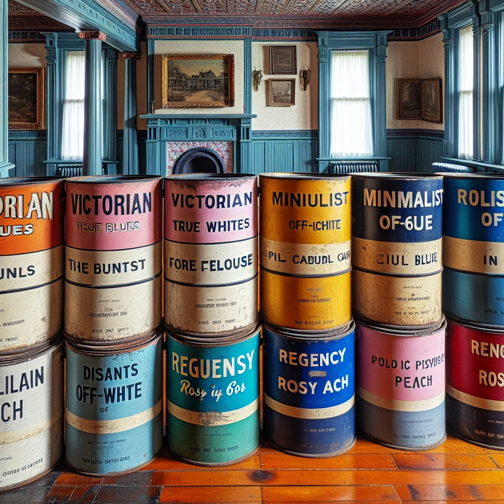
Historic Color Palettes By Style: A Comparative Approach
Delving into the comparative approach of historic color palettes by style illuminates the evolution of interior aesthetics. Let’s unravel the distinct hues that characterized each era:
- Georgian homes embraced a palette influenced by nature, featuring sage green, powder blue, and soft gray.
- Federal style interiors often showcased bolder contrasts with deep blues, rich greens, and warm terra-cotta complimenting architectural details.
- Early colonial colors were practical and muted, due to the limited pigments available, resulting in subdued earth tones.
- During the Victorian era, technological advancements in paint production led to vibrant and extravagant colors like emerald green, peacock blue, and burgundy.
- Craftsman style homes favored earthy and harmonious colors, reinforcing their connection to nature; think olive greens, burnt oranges, and warm browns.
- Spanish Revival architecture invited the warmth of the Mediterranean with terracotta, ochre, and turquoise reflecting the region’s palette.
- Mid-Century Modern spaces often incorporated both neutral tones and bold accent colors, reflecting a modernist appreciation for both minimalism and expressionism.
By examining these historical preferences, homeowners can make informed decisions that pay homage to their home’s origins while imbuing their spaces with a sense of time-honored elegance.
Resources for Researching Historic Paint Colors
To delve into the world of historic paint colors, numerous resources stand at your disposal. Begin by exploring paint manufacturers that offer historically accurate lines, such as Benjamin Moore’s Historical Collection or Sherwin-Williams’ Historic Collection, which can provide a curated selection matching the era of your home.
Online databases from preservation societies can also serve as valuable tools. The National Trust for Historic Preservation, for example, hosts a wealth of information on period-specific aesthetics. For a hands-on examination, consider visiting local historic homes or museums to see authentic color schemes in place.
For more detailed investigations, architectural conservation books provide in-depth studies on period colors and their application. Similarly, historic color charts, often found at libraries or archived online, offer insights into the popular palettes of specific time periods.
Last but not least, don’t overlook the power of social media and forums. Online communities of restoration enthusiasts may offer suggestions, share experiences, and provide visual inspiration to guide your color choices.
FAQ
What color to paint an old house?
To maintain historical accuracy, an old house should ideally be painted in red, yellow, green, or white, the last having gained popularity as a body color only from around 1820.
Which paint is best for old house?
The best paint for an old house is either limewash or clay-based due to their high breathability, natural solvent-free properties, odour absorption, and resistance to bacteria.
What were the colors of the 1920s interior design?
The colors of the 1920s interior design were primarily inspired by nature, including hues of greens, beiges, and creams.
How to choose the perfect paint color for a Victorian-style home?
Choosing the perfect paint color for a Victorian-style home involves analyzing the home’s era and architectural elements, considering its neighborhood context, and selecting a harmonious color palette that typically includes three to six shades.
What are the traditional color schemes for Colonial-era interiors?
Traditional color schemes for Colonial-era interiors typically include muted colors such as sage green, barn red, blue, mustard yellow, and cream.
How did the trends in paint colors change in old American houses from the 1950s to the 1970s?
The trends in paint colors in old American houses shifted from pastel shades and primary colors in the1950s to earthy and bold colors in the 1970s.
Read More Like This
 15 Homecoming Decoration Ideas to Elevate Your Celebration
 15 Christmas Cake Decorating Ideas to Sweeten Your Holidays
 15 Outdoor Party Tent Decorating Ideas for a Magical Celebration
 15 Ideas for Welcome Home Decorations
 15 Cheap Table Decoration Ideas to Elevate Any Gathering
Recap: