Last updated on
Because historic home paint colors offer a unique insight into the architectural aesthetics of bygone eras, understanding them can significantly enhance your appreciation for these remarkable structures.
Key takeaways:
- Georgian Era*: Subdued, muted, soft stone hues, blues, greens, reds.
- Victorian Period*: Vibrant, bold, contrasting shades, blues, greens, purples.
- Craftsman Style*: Nature-inspired tones, olive greens, warm browns, mustard yellows.
- Spanish Revival*: Stark contrasts, white walls, dark, vividly colored accents.
- Considerations for choosing historic colors*: Research, regional influences, material, historical periods, trends.
Explore Authentic Historic Colors By Era
Understanding historic home paint colors demands attention to the architectural styles and periods from which they originated. Different eras favored distinct color palettes that reflected the cultural, social, and artistic movements of their time.
Georgian Era: Think subdued and muted. Natural pigments available during the 18th century meant colors were limited. Classic choices ranged from soft stone hues to deeper blues, sage greens, and earthy reds.
Victorian Period: The advent of synthetic pigments brought about vibrant and bold colors. Homes often featured ornate trim in contrasting shades like bright blues, greens, purples, and even terracotta.
Craftsman Style: Early 20th century saw a preference for nature-inspired tones. Olive greens, warm browns, and mustard yellows were commonly used, creating harmonious and cozy environments.
Spanish Revival: This style is marked by its stark contrasts and rich colors. Walls were often white or off-white to cool the interiors, juxtaposed with dark, vividly colored tile work, and iron elements.
Each historical period had its unique aesthetic, influenced by the available materials and cultural priorities of the age. A faithful restoration not only revives these colors but also honors the architecture’s historical narrative.
Georgian Paint Colors
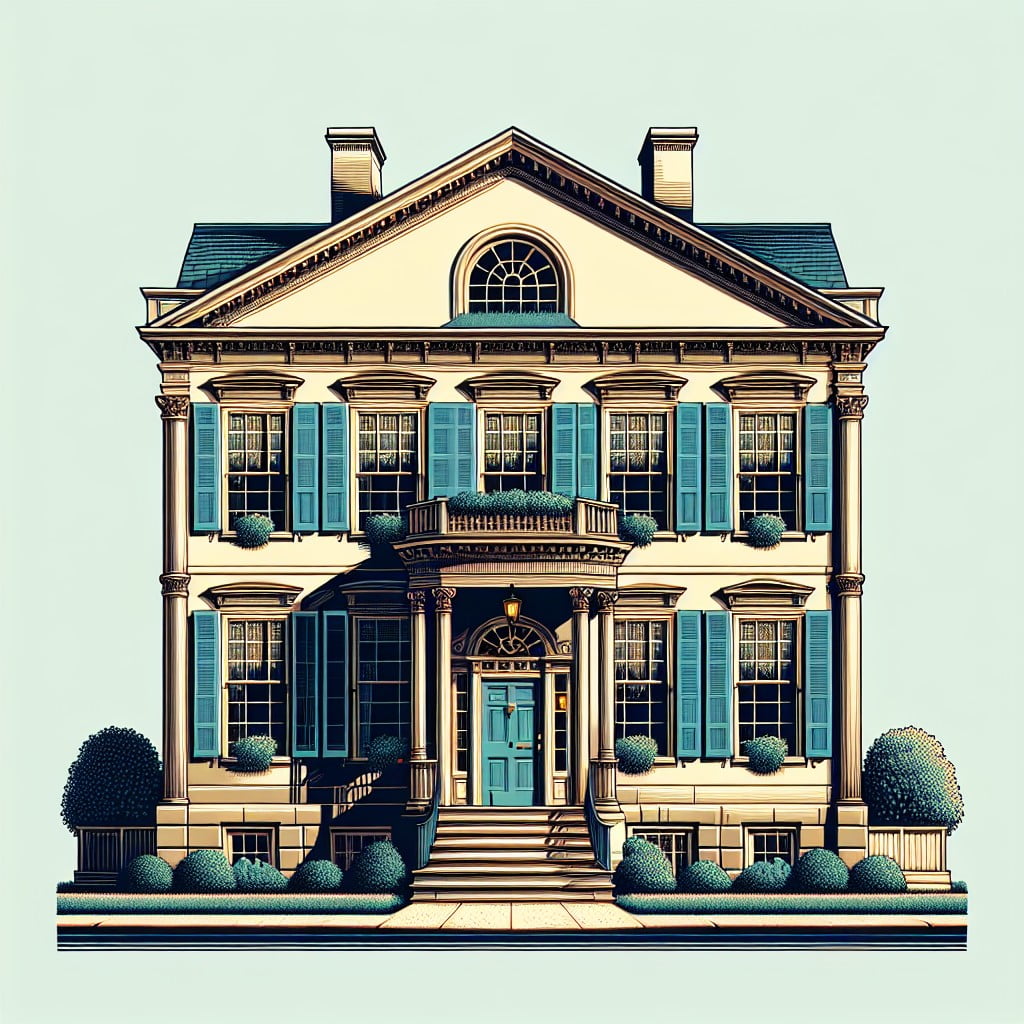
During the Georgian era, spanning from 1714 to 1830, color palettes were heavily influenced by natural pigments, which led to a selection of soft and muted hues. Reflecting the architectural grandeur of the period, the typical palette comprised dusky whites, soft earth tones, and pastels that were regarded as elegant and sophisticated.
Notable choices included:
- Sage green, a reflection of the period’s love for gentle, nature-inspired tones.
- Paris green, a brighter accent popular in the later part of the era.
- Stone colors such as off-whites and beiges, providing a neutral backdrop that exuded a sense of warmth and solidity.
- Sky blue, an ethereal color that added a touch of serene elegance to interior spaces.
- Burgundy and Prussian blue, used sparingly for a regal contrast in stately rooms.
While bold colors were available, they were often more expensive and used in finer homes or for detailing. The use of paint was also a status symbol, with higher quality pigments indicating greater wealth. As you restore or refresh a Georgian-style home, these colors offer a sense of time and place, enhancing historical charm with authenticity.
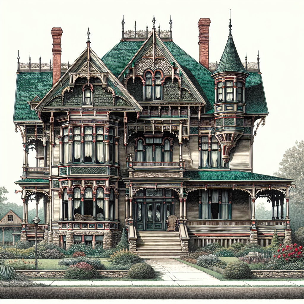
Victorian: Layered Brights
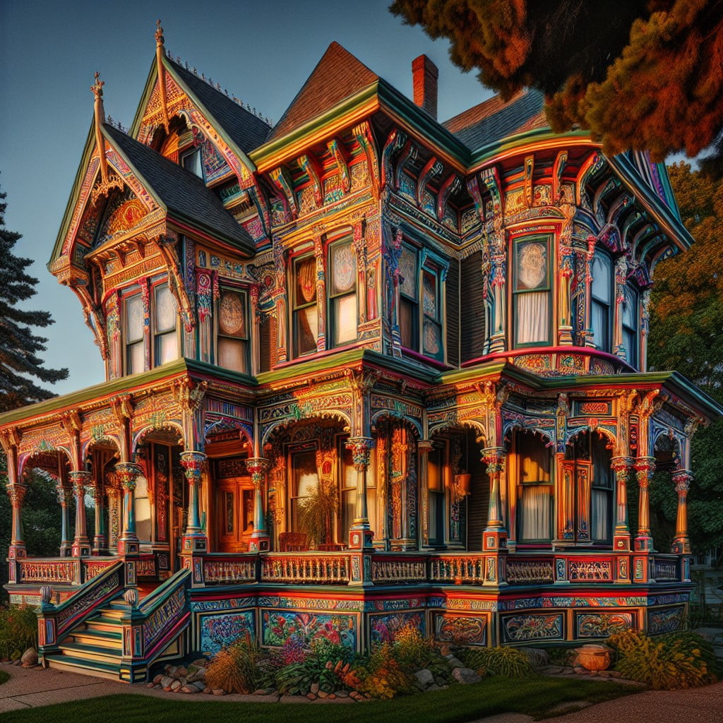
The vibrancy of the Victorian era is unmistakably captured in its use of bold and often unexpected color combinations. Homes of this period were typically adorned with a variety of hues, each serving to highlight the intricate architectural details that define Victorian style.
Deep reds and forest greens were common, providing a rich backdrop for ornamental gables and trim. This was paired with brighter, eye-catching shades like cobalt blue and canary yellow to accentuate porches and decorative woodwork.
These brightly layered tones were applied in a purposeful way, with lighter colors often used to emphasize upper stories and darker shades grounding the lower portions of the home. This technique helped define the building’s overall structure while creating a sense of balance and proportion.
To emulate these authentic paint schemes, consider using a three-color palette as a base: a dominant shade, a secondary color, and an accent tone. In doing so, the delightfully eclectic charm of the Victorian aesthetic can be authentically preserved or recreated.
Craftsman: Warm Tones
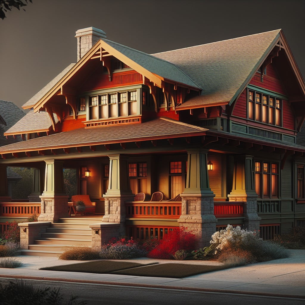
As you enter the world of Craftsman homes, you’re met with a distinctive palette reflecting the style’s embrace of nature and handcrafted quality. Earthy reds and muted greens mirror the foliage and terra firma, creating a symbiotic relationship between the home and its natural surroundings. Burnt oranges and warm browns recall the hues of autumn leaves, reinforcing the organic aesthetic inherent in these structures.
The use of stains for woodwork highlights the grain, celebrating the materials’ textures and intrinsic beauty. This unpretentious approach favors solidity and warmth, characteristics that make a Craftsman house feel like a cozy refuge. To complement these rich, nature-inspired colors, accents in subdued blues and soft yellows often appear, providing contrast without clashing with the dominant warm tones.
When selecting paints, historical accuracy might lead you to opt for matte or low-lustre finishes that lend an understated elegance and period-appropriate authenticity. These choices not only pay homage to the Craftsman ethos but also enhance the architectural features, like the prominent porches and broad gabled roofs, creating a harmonious visual experience that has stood the test of time.
Spanish Revival: Deep and Rich
Inspired by the architecture of Spain and Latin America, Spanish Revival homes typically feature stucco walls, terracotta roof tiles, and wrought iron accents. The color palette for these homes leans towards deep, warm hues that reflect the Mediterranean and Moorish influences on the style.
- Walls are often painted in earthy tones, such as warm white, creamy beige, or muted terracotta, providing a sun-washed appearance that resonates with the homes’ regional heritage.
- Accent colors embrace the richness of the style, with dark reds, deep blues, and rich greens highlighting decorative tiles, exposed wooden beams, and ironwork.
- For a truly authentic look, door and window trims are frequently finished with a dark wood stain or a deep brown or black paint to contrast with the lighter stucco walls.
These colors are historically rooted in the natural pigments available in the regions that influenced Spanish Revival design, creating a harmonious link between the architecture and its color scheme.
Historic Exterior Paint Colors
The exteriors of historic homes are a palette that reflects the architectural style and period. When it comes to authentic restoration or replication, color plays a pivotal role.
1. Research and Records: Old catalogs, historic registries, and even physical paint analysis can provide clues to the original hues used on a property.
2. Regional Influences: Consider the area’s climate and natural surroundings. Coastal homes often sported lighter, sun-reflective colors, while inland homes utilized darker tones to withstand the elements.
3. Material Matters: The type of material, be it wood, brick, or stone, influenced color choices. Natural finishes were popular in rural settings, accentuating the material’s beauty, while urban homes often featured a variety of painted surfaces.
4. Historical Periods: Different eras favored different palettes. Colonial homes were often muted with natural pigments, whereas Victorian homes showcased exuberant color schemes reflecting new aniline dyes.
5. Trends Over Time: Colors that were popular in one decade may have been replaced by new trends in the next, leading to an evolution in the palette. This can signal when a home may have undergone updates or expansions.
6. Paint Technology: As advancements in paint production occurred, the variety and durability of colors expanded, influencing the shades that were achievable and popular during certain periods.
Through these lenses, you gain insight into the thoughtful consideration behind a historic home’s exterior color, ensuring a restoration that honors its past.
Geographical Location and Its Impact On Color Choice
The environment around a historic home often dictated the color palette used. For example:
- Coastal homes favored light, breezy hues that reflected the water and sky, such as various shades of blue and soft whites, facilitating a seamless blend with the surrounding seascape.
- In the desert, homeowners opted for earthy tones like terracotta, beige, and muted reds to harmonize with the arid landscape and the often sun-baked surroundings.
- Areas surrounded by forests or rich in natural resources saw the use of deeper greens and browns, taking cues from the trees and earth to craft a home that felt like an extension of the natural world.
- Homes in colder climates where there might be snow for a significant part of the year occasionally featured bold reds or dark blues for their visibility against the stark whiteness.
These decisions were not only aesthetical but also practical. Lighter colors reflected heat in sunny locales, while darker colors could absorb and retain warmth in cooler regions. Local availability of pigments also played a vital role; in sparse areas, homeowners often used what was readily accessible, leading to regional color differences.
Historic Interior Paint Colors
Historic interior paint colors were often derived from the limited pigments available during their respective periods, resulting in colors that were less saturated compared to modern hues. For instance, Colonial interiors often featured soft, earth-toned colors such as muted blues, greens, and grays, reflecting the natural pigments available. The Victorian era, however, embraced a more vibrant palette with deep reds, greens, and golds, aligning with the period’s love for opulence and detail.
Moving into the 20th century, the Arts and Crafts movement brought about rich, warm tones that were meant to harmonize with the movement’s emphasis on natural materials and artisanal craftsmanship. Historical paint colors also served practical purposes: lighter colors were used in smaller, less-lit spaces to make them appear larger and brighter, while dark, rich colors were often found in larger, more formal spaces.
Key considerations for choosing historic interior colors include:
- 1. Period accuracy: Research the time period of the home to select appropriate color palettes.
- 2. Color technology: Understand the evolution of paint technology to match the kind of paint that would have been used.
- 3. Architectural elements: Consider the home’s woodwork, flooring, and lighting when selecting colors.
- 4. Functionality of rooms: Choose colors that reflect the historical use of each room, whether it’s a formal dining room or a cozy study.
Reproduction of historic paint colors is offered by many modern paint manufacturers, allowing homeowners to achieve period-appropriate looks with the benefits of contemporary paint quality and durability.
Choosing Accurate Historic Paint Colors for Restoration
When tackling a restoration project, selecting the right paint colors is crucial for historical accuracy. Here are key considerations:
1. Research: Examine old photographs, architectural drawings, and historical documents related to the building. Visit local historical societies for guidance.
2. Paint Analysis: Often layers of paint can be analyzed to uncover original colors. This scientific approach provides precise data for color matching.
3. Period Colors: Manufacturers offer collections based on historic color palettes. These ranges are designed to reflect the hues of a specific era.
4. Contemporary Matches: For practicality, choose modern paint equivalents that mimic historic shades. This provides the benefit of improved paint technology with a nod to history.
5. Consult Experts: Consider hiring a color consultant specializing in historic properties to ensure your choices are period-appropriate.
6. Contextual Harmony: Look to neighboring buildings from the same period for a color scheme that fits the historical context of the area.
Remember, investing time in selecting the right paint colors pays off in maintaining the integrity and honoring the story of a historic home.
Historic Paint Color Palettes and Their Modern Equivalents
Preserving the authenticity of a historic home while utilizing modern paint offerings can be a rewarding process. Historical paint color palettes often employed natural pigments, resulting in a particular depth and richness that many contemporary paints emulate. By understanding the elements that define these traditional shades, homeowners can make informed choices when selecting modern equivalents.
- Natural Pigments: Historic paints often included natural pigments which faded over time, today’s formulas replicate these shades with colorfast options for longevity.
- Color Matching: Utilize color matching technology to find contemporary paints that closely resemble historic hues.
- Historic Collections: Many paint manufacturers offer collections specifically tailored to historic color schemes, facilitating the selection process.
- Matte Finishes: Opt for matte or flat finishes to mimic the less glossy appearance of early paint formulations.
- Sample Patches: Test modern paint swatches in situ to examine how light and environment affect the color, ensuring an authentic recreation.
Using these guidelines, the modern restorer can honor the integrity of a historic home’s design while benefiting from the advancements in paint technology.
FAQ
What are the colors for historic homes?
The colors typically used for historic homes were primarily reds, yellows, and greens, with white often reserved specifically for trim in the 18th century.
Does Sherwin Williams have historic colors?
Yes, Sherwin Williams offers historically relevant color palettes referential to specific time periods.
How do I find old paint colors?
To find old paint colors, one can examine potential leftover cans possibly stored in the basement or garage by previous homeowners, as these cans typically have the color indicated on the lid, or attempt to match the wall color with paint chips, albeit this approach often yields less successful results.
What factors determine the appropriate historic paint colors for a specific era home?
The appropriate historic paint colors for a specific era home are determined by factors such as the architectural style, the region, the house’s construction era, and original paint schemes found during restoration or research.
Where can one access archives or databases for historic paint colors?
One can access archives or databases for historic paint colors from resources such as the National Archives, Library of Congress, historical societies, preservation organizations, and specific paint companies’ historic lineups.
Are there standardized guidelines for selecting and using historic paint colors?
Yes, there are standardized guidelines for selecting and using historic paint colors, often provided by historic preservation societies and organizations.
Read More Like This
 15 Homecoming Decoration Ideas to Elevate Your Celebration
 15 Christmas Cake Decorating Ideas to Sweeten Your Holidays
 15 Outdoor Party Tent Decorating Ideas for a Magical Celebration
 15 Ideas for Welcome Home Decorations
 15 Cheap Table Decoration Ideas to Elevate Any Gathering
Recap: