Last updated on
Unleash the power of optimal produce display because it can remarkably boost your grocery store’s appeal, fuel impulse purchases, and catapult your sales.
I’ve designed unique illustrations for these ideas. I hope you get inspired!
In the world of produce display, creativity is key, and innovation is always welcomed. With an abundance of ideas available online, it’s easy to get overwhelmed and feel lost.
Although you’ll find reliable resources for the ‘best of the best’ existing ideas at the end of this piece, the main focus lies on sparking fresh inspiration. Curating a list of unique and unconventional ideas, this article has been crafted to offer perspectives potentially overlooked in many traditional approaches.
Geared towards revolutionizing your display methods, these fresh insights will help you enhance your arrangements, enabling your produce to captivate even more prospective customers. Set to uncover new angles, let’s dive into the world of unique produce display ideas.
INCORPORATE INTERACTIVE DISPLAYS
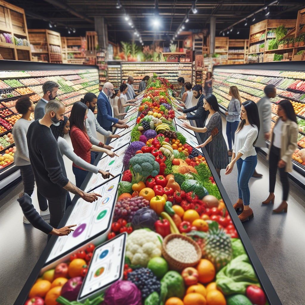
Enhance the shopping experience with touch screens and tablets placed alongside the produce that invite customers to engage with informative content on food origins, recipe ideas, and nutritional facts. Consider implementing a digital scale that provides instant feedback on purchase quantities and potential uses.
Encourage shoppers to vote on their favorite fruits and vegetables, or what they’d like to see in store through interactive polls, fostering a sense of community involvement. Engage younger shoppers with educational games about healthy eating, transforming the produce aisle into a dynamic learning environment.
These interactive elements grab attention, provide entertainment, and most importantly, educate your customers, making them feel involved and informed as they make their selections.
THEME-BASED PRODUCE DISPLAYS
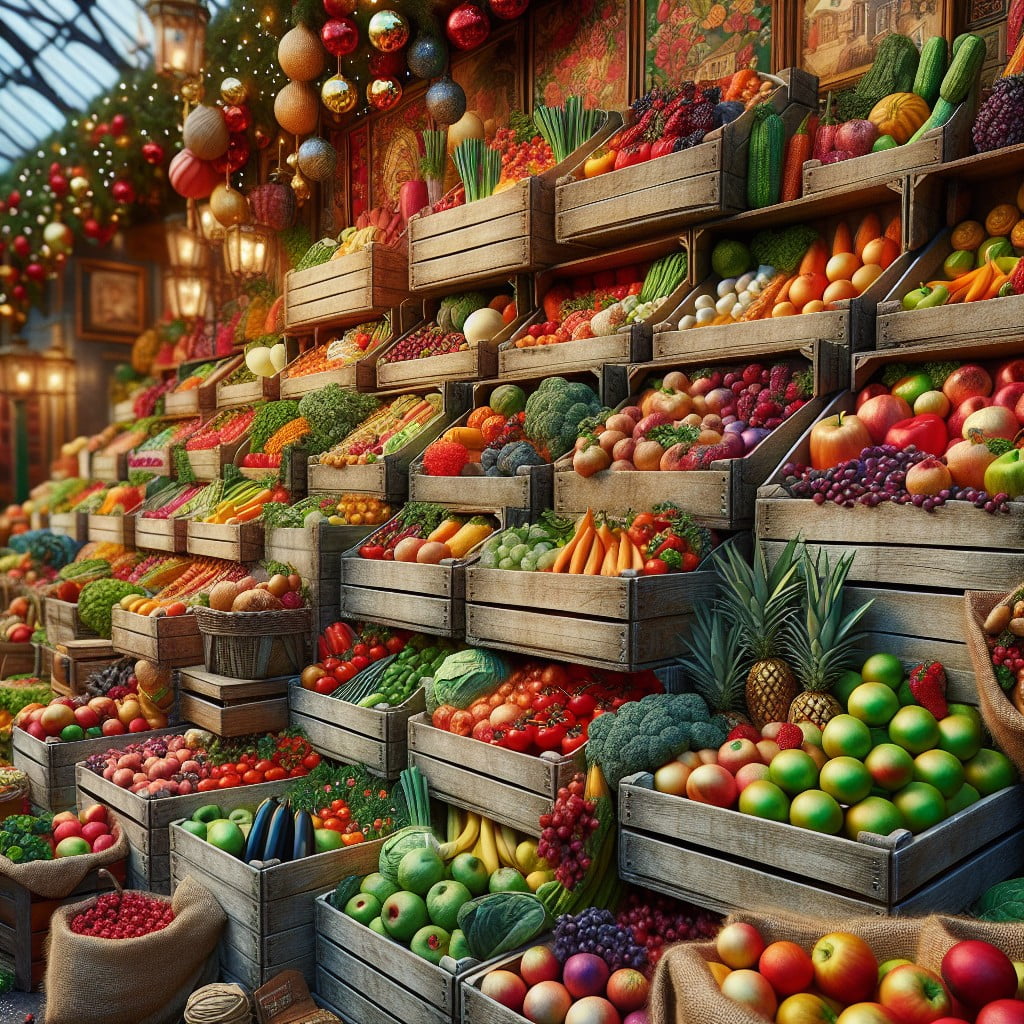
Capitalizing on seasonal trends or holidays, theme-based arrangements can significantly boost the visual appeal of your produce section. For example, during autumn, integrate pumpkins, gourds, and corn with warm-colored leafy decorations to evoke a festive fall atmosphere.
For summer displays, bright berries, watermelons, and citrus fruits can be complemented with props like sunglasses and beach balls to suggest freshness relevant to the season.
Incorporating cultural themes can also be a great way to celebrate diversity and introduce customers to new products. For instance, arranging Asian greens alongside bamboo steamers during the Lunar New Year or presenting an array of chili peppers and tomatillos for Cinco de Mayo festivities can engage customers’ curiosity and encourage them to try new flavors.
Interactive elements like recipe cards or cooking tips related to the theme not only serve an educational purpose but also inspire customers to purchase multiple items from the display to recreate the dishes at home.
Remember, the key to a successful theme-based display is authenticity—ensure all elements contribute to a cohesive and culturally respectful presentation.
DISPLAY PRODUCE IN AUTHENTIC CRATES
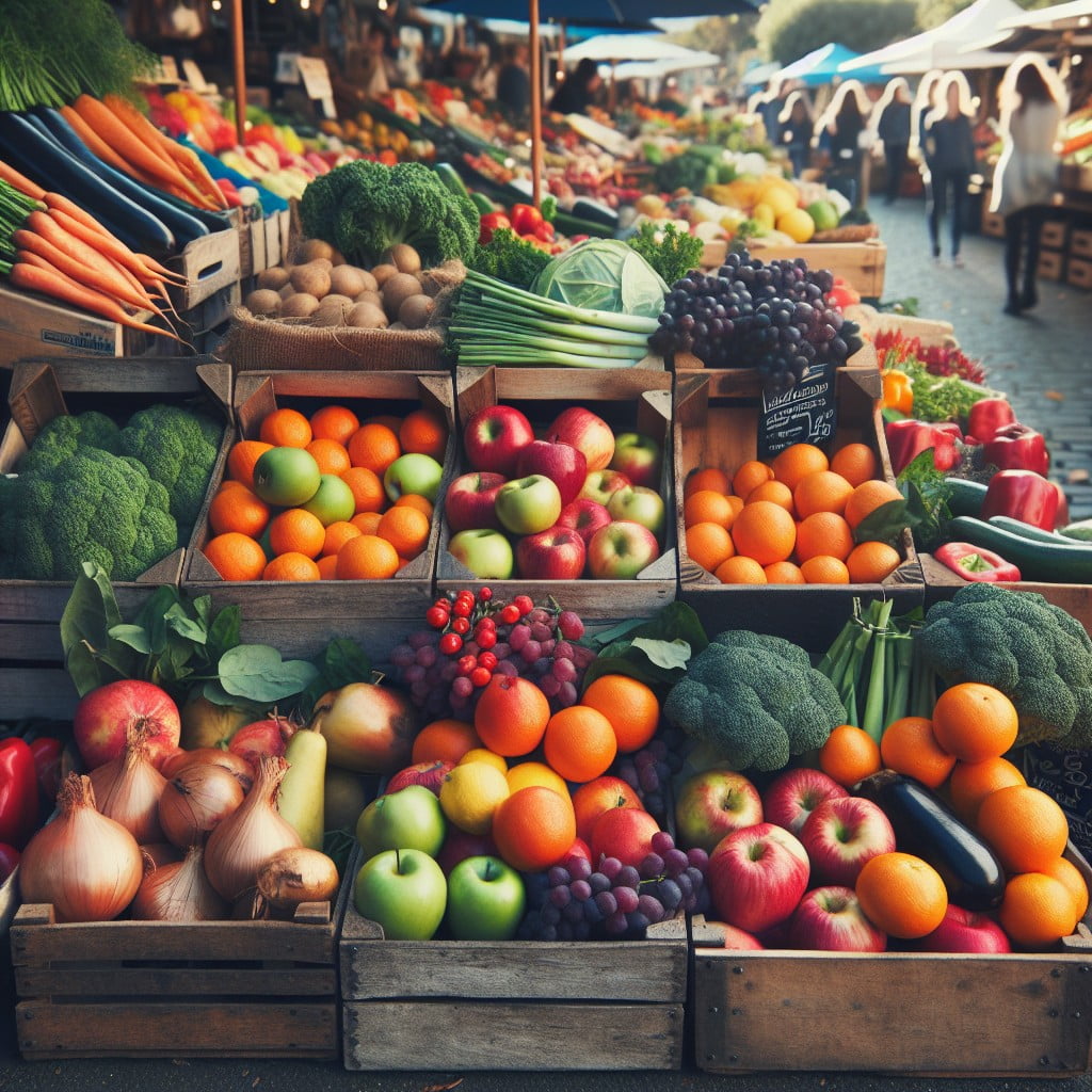
Utilizing wooden crates for your fruits and vegetables not only adds a rustic charm but also enhances the overall aesthetic. This approach mimics a farmers’ market feel, suggesting freshness and quality to customers.
Ensure the crates are clean and free from splinters to maintain a safe shopping experience. Staggering and stacking the crates at different heights makes the display more visually appealing and allows for easier browsing.
Additionally, consider the following:
- Vary the orientation of crates to create visual interest, with some placed horizontally and some vertically.
- Mix different crate sizes to fit produce accordingly, using smaller ones for delicate items like berries.
- Leave adequate space between crates to prevent bruising and to allow air circulation, keeping the produce fresh.
- Label each crate clearly, providing information about the produce origins and price to aid in customer selection.
By keeping these points in mind, the authentic crate display can effectively attract attention and encourage customers to buy more produce.
USE HEIGHT TO CREATE AN INTERESTING LAYOUT
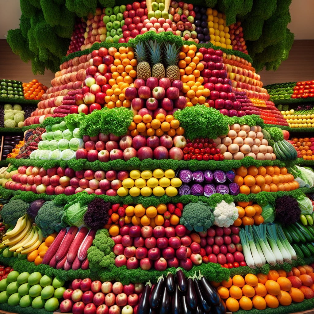
Maximizing vertical space not only draws the eye upward but also enhances the visual appeal of the display. Employ tiered stands or stacking bins to create levels that present fruits and vegetables in a more dynamic fashion.
This tiered arrangement allows for a clear view of all items, even those at the back. Shelves set at differing heights can also break up the monotony and encourage shoppers to take their time browsing through the selection.
Use hanging baskets for items like vine tomatoes or bananas to add another layer of interest and ensure that every product is showcased effectively. Remember to place sturdier, heavier items on the bottom and lighter, delicate produce on top to prevent bruising.
This use of height is not just a visual strategy; it aids in space efficiency, making the most of your display area.
INTEGRATE LOCAL PRODUCE WITH A HIGHLIGHTED SIGNAGE
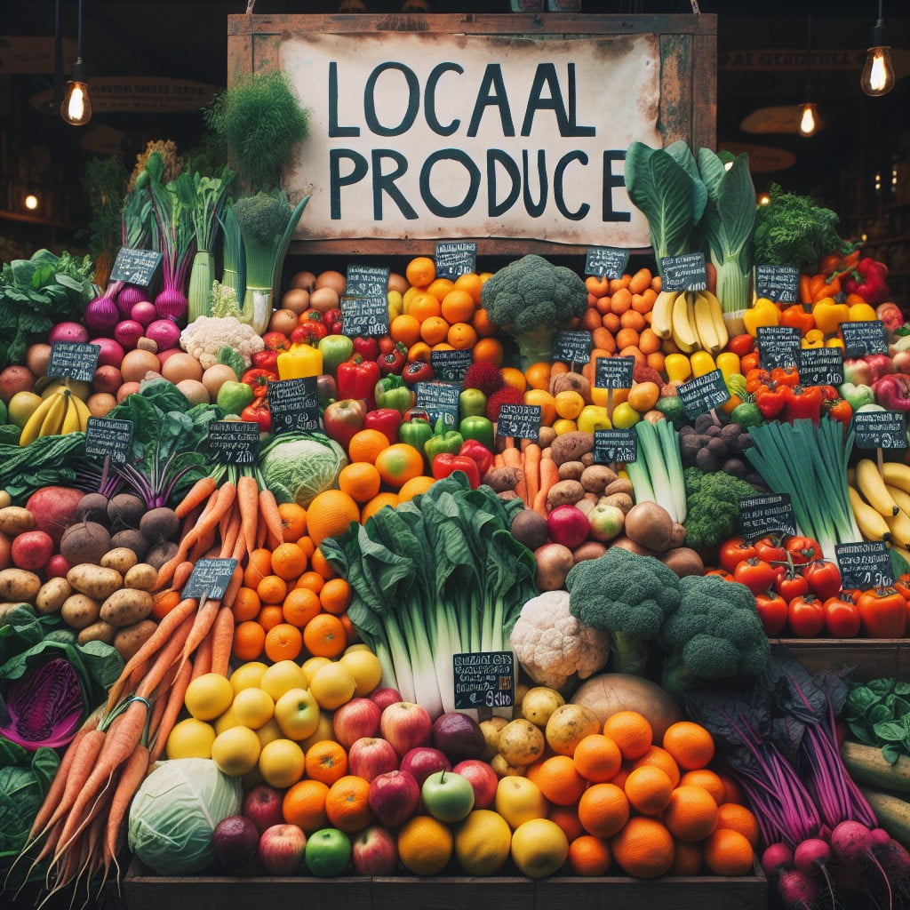
Supporting local farmers not only bolsters community economies but also appeals to environmentally conscious consumers. Utilize prominent signage that touts the local origins of the produce to attract attention. Bright colors and a distinctive design can make these signs stand out.
Furthermore, incorporate storytelling through your signage by providing details about the farms and the farmers who cultivate the fruits and vegetables. This creates a personal connection and adds authenticity to the buying experience. Engage shoppers further with images showing the journey from farm to store which can also enhance the visual appeal of your displays.
CREATE A RAINBOW OF COLORS WITH FRUITS AND VEGETABLES
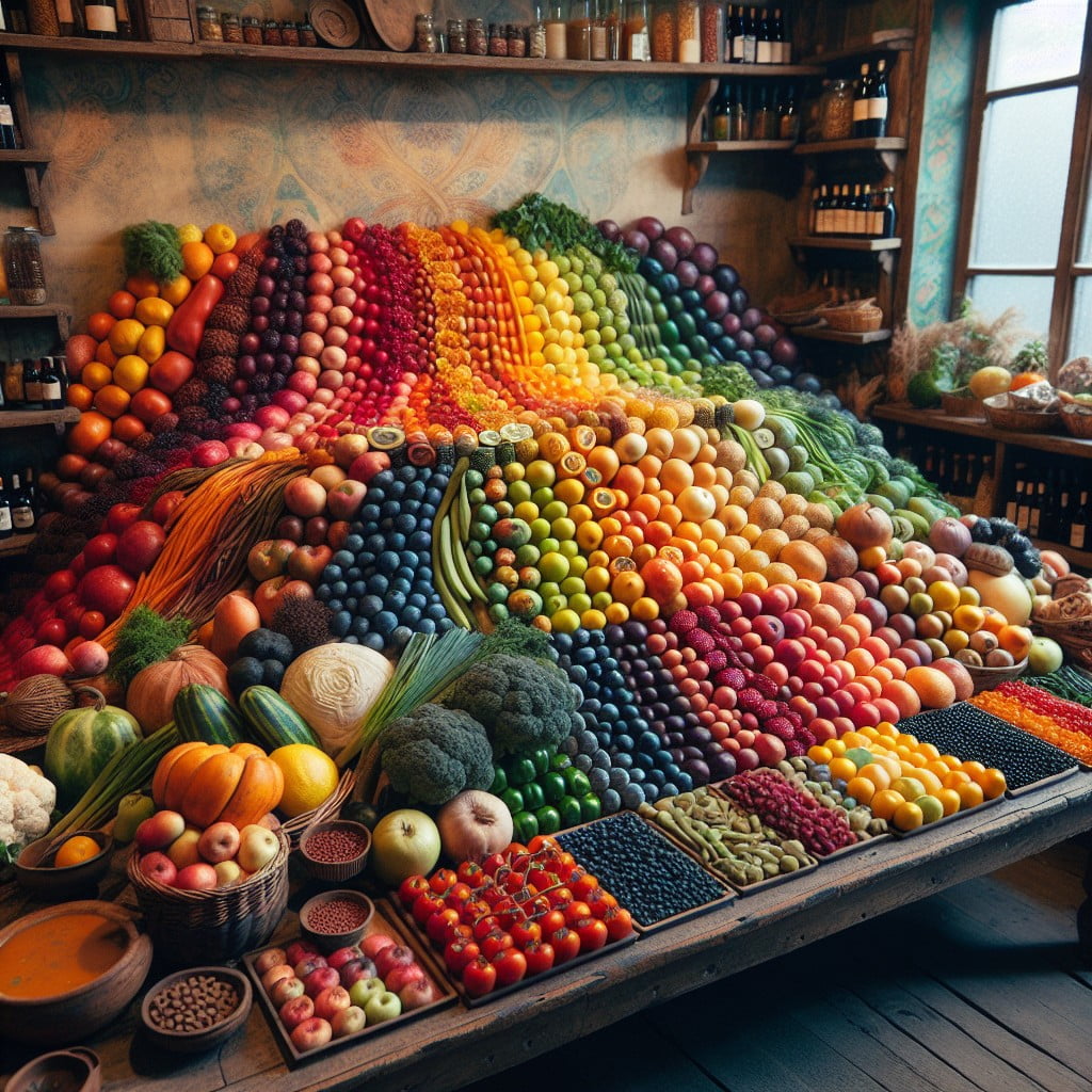
Organizing fruits and vegetables by color not only makes your produce section visually appealing but also subtly guides customers through a nutritious spectrum.
Begin with vibrant reds like tomatoes and strawberries, transitioning to the bright orange of tangerines and carrots.
Follow with yellows, including bananas and bell peppers, then greens from limes to leafy vegetables.
Progress to the deep blues and purples of blueberries and eggplants.
This layout mimics the natural order of a rainbow and can make healthful choices more enticing for shoppers.
Additionally, group similar shades together to create a gradient effect, providing a smooth visual flow that can lead to increased customer satisfaction and potentially higher sales.
USE CHALKBOARD SIGNS TO LABEL PRODUCE
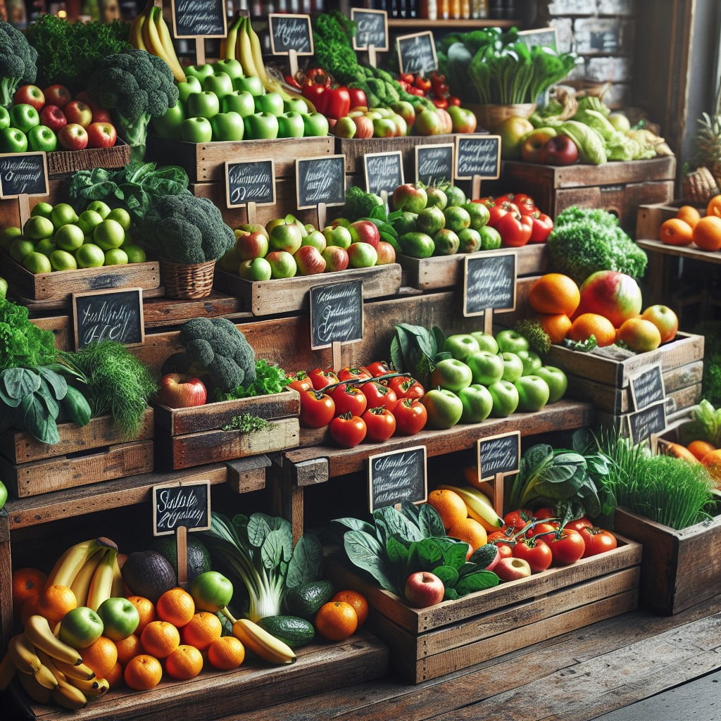
Chalkboard signs add a rustic charm and can make product names, prices, and specials stand out. These easily changeable signs allow for quick updates and can be written in various fonts to catch the customer’s eye.
They contribute to a friendly market atmosphere and can provide additional information such as recipe suggestions or nutritional facts. Moreover, using chalkboards can reduce paper waste, making them an eco-friendly option.
For added visual appeal, include drawings of the produce or related items like a loaf of bread next to tomatoes to inspire customers to make bruschetta.
PLACE COMPLEMENTARY PRODUCTS SIDE BY SIDE
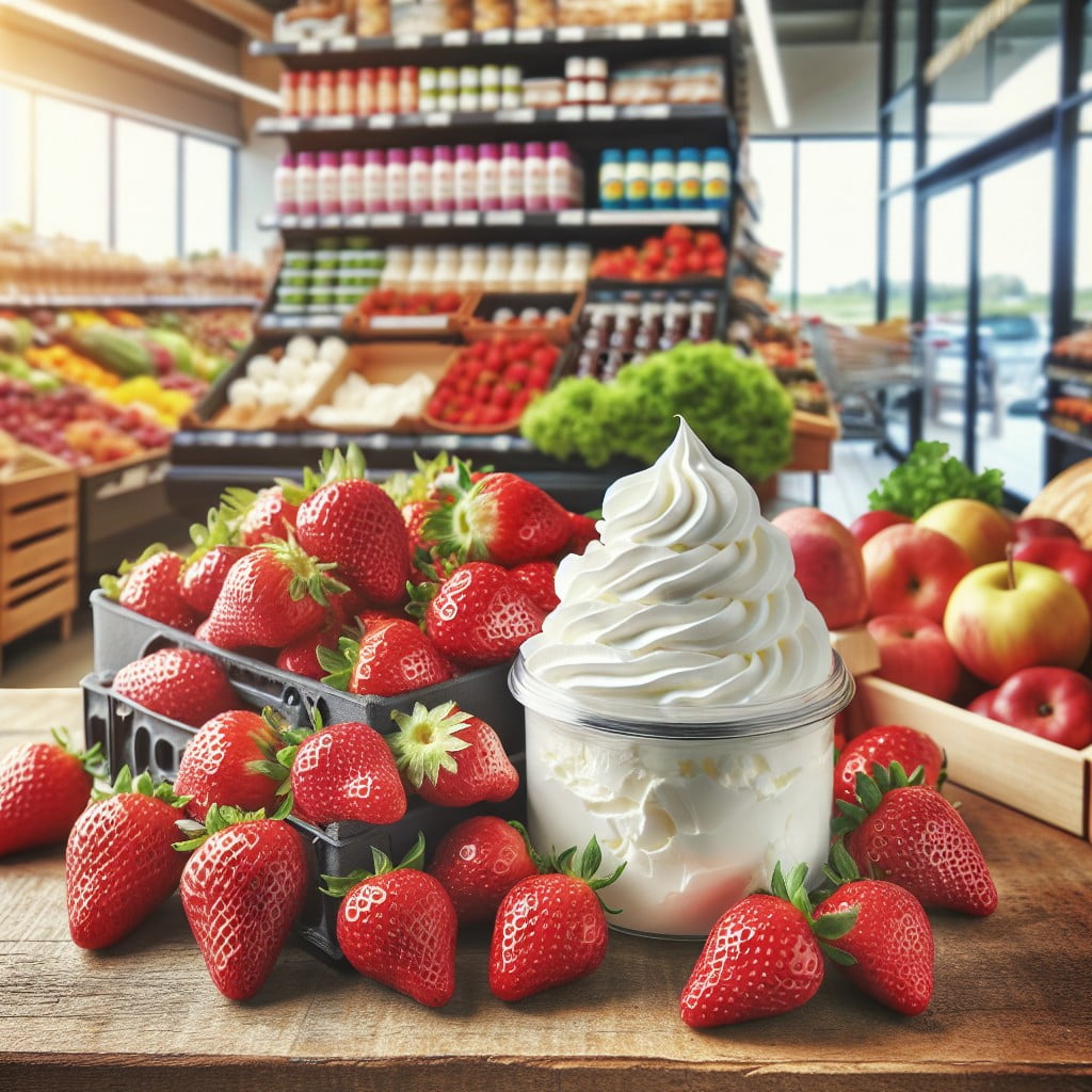
Grouping items that pair well together not only simplifies the shopping experience but also encourages additional purchases. Consider placing ripe tomatoes near fresh basil and mozzarella for shoppers inspired to make a Caprese salad.
Likewise, display avocados next to limes and cilantro to suggest the makings of fresh guacamole. This method can inspire meal ideas and makes it convenient for shoppers to pick up all the elements they need for certain recipes.
Moreover, it subtly promotes the sale of each product when they’re seen as part of a bigger picture rather than in isolation.
SHOWCASE ORGANIC PRODUCE SEPARATELY
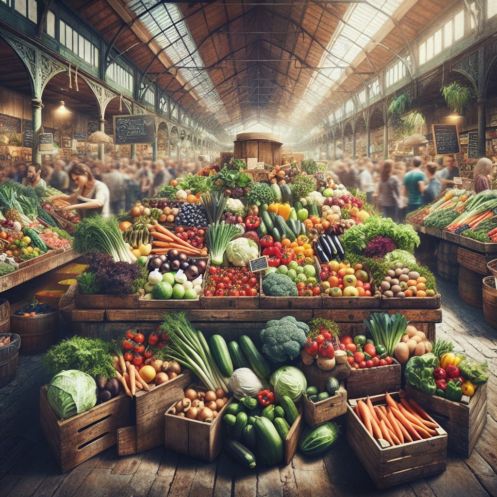
Dedicating a distinct area for organic items caters directly to health-conscious consumers who prioritize chemical-free produce. This approach not only makes it convenient for shoppers to find what they’re looking for but also underscores your store’s commitment to offering quality options.
To enhance this section:
- Use clear, prominent signage with eye-catching green hues commonly associated with organic foods.
- Place educational materials about the benefits of organic eating close to the products to inform and motivate purchases.
- Partner with local organic farmers and spotlight their stories and farming techniques to build trust and connect with the community.
- Consider arranging the products on wooden shelves or in baskets for a rustic, ‘back-to-nature’ ambiance that complements the organic theme.
GREENARY AS A BACKGROUND TO PROMOTE FRESHNESS
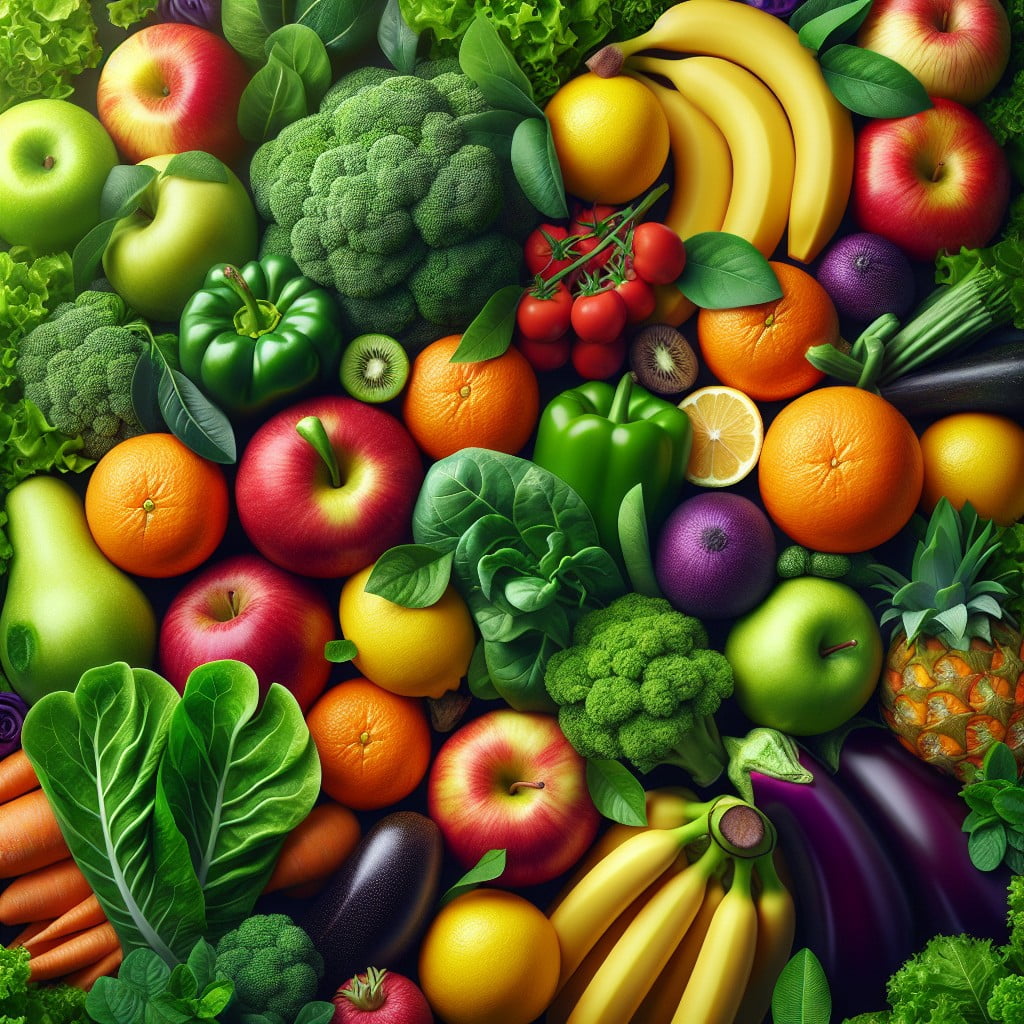
Utilizing lush greenery as a backdrop instantly conveys freshness, tapping into the subconscious association customers make between vibrant foliage and the vitality of fruits and vegetables. This visual cue encourages the perception of produce being just-picked and garden-fresh.
Consider these points:
- Intersperse leafy plants among the produce to maintain a natural, garden-like setting throughout the display.
- Use varying shades of green to add depth and make the colors of the fruit and vegetables pop by contrast.
- Place taller plants at the back of displays to give a layered look that draws the eye inward.
- Ensure the greenery is well-maintained, mimicking the care taken to cultivate the fresh produce on offer.
- Opt for non-intrusive greenery that complements rather than overshadows the produce.
Green accents not only decorate but also refresh the shopping experience, subtly enhancing the appeal of the produce selection.
ETHNIC INSPIRED PRODUCE DISPLAYS
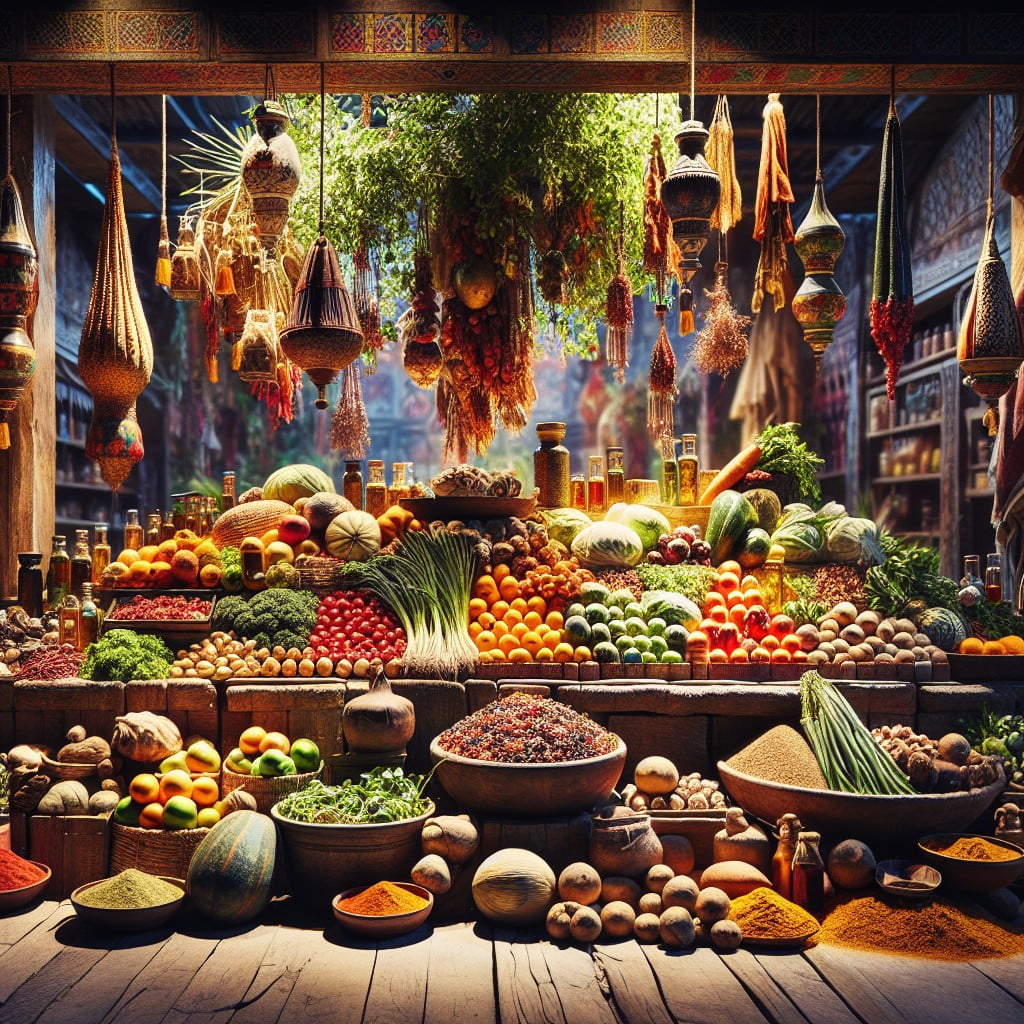
Capitalizing on the diversity of global cuisines can transform a standard produce section into a vibrant cultural experience. By grouping vegetables and fruits commonly used in specific regional cooking, you cater to ethnic communities and inspire others to try new recipes.
Stock items like tomatillos, jicama, or bok choy, and consider adding specialty herbs and spices to complement them. Clear, informative signage explaining the origins of the produce and suggested uses can educate customers and encourage exploration.
Seasonal displays focused on holidays like Lunar New Year or Diwali can also add a festive touch that educates and excites shoppers about different culinary traditions.
CREATE A FUNCTIONAL YET AESTHETICALLY PLEASING DISPLAY
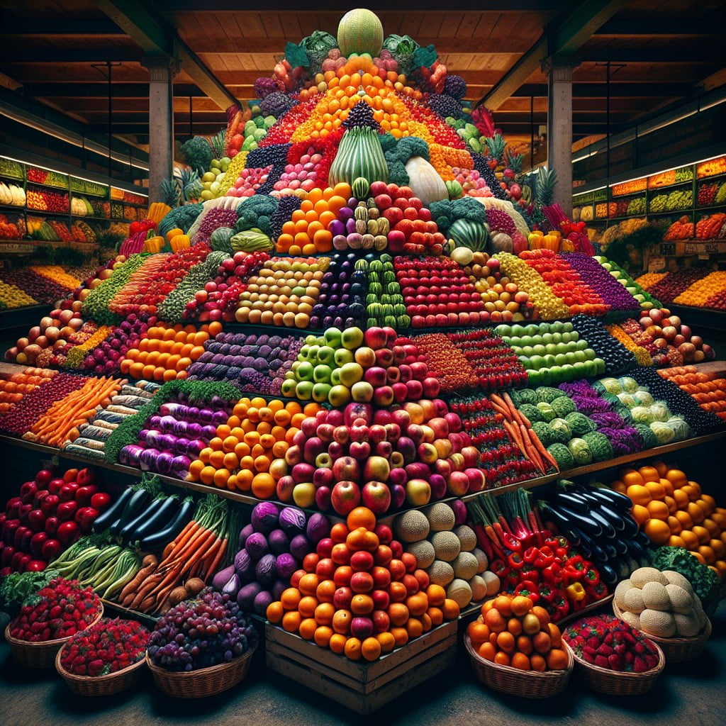
Blending practicality with visual appeal, your produce display should be as much a feast for the eyes as the produce is for the palate. Achieve this by:
- Utilizing clean, clear signage that directs customers while contributing to the overall design.
- Arranging fruits and vegetables to maximize space, making each item easily accessible without overcrowding.
- Incorporating multi-level stands that offer visual interest and an easier reach for products at different heights.
- Ensuring adequate lighting to highlight the freshness and vibrant colors of your produce.
- Placing delicate items, like herbs and berries, at eye level where they can be admired, but also where they aren’t prone to being bruised.
- Organizing the display so customers can flow through it effortlessly, preventing congestion.
Remember, your display serves as a silent salesperson; it should not only look inviting but also enhance the shopping experience.
SCENTED DISPLAYS TO ENTICE CUSTOMERS
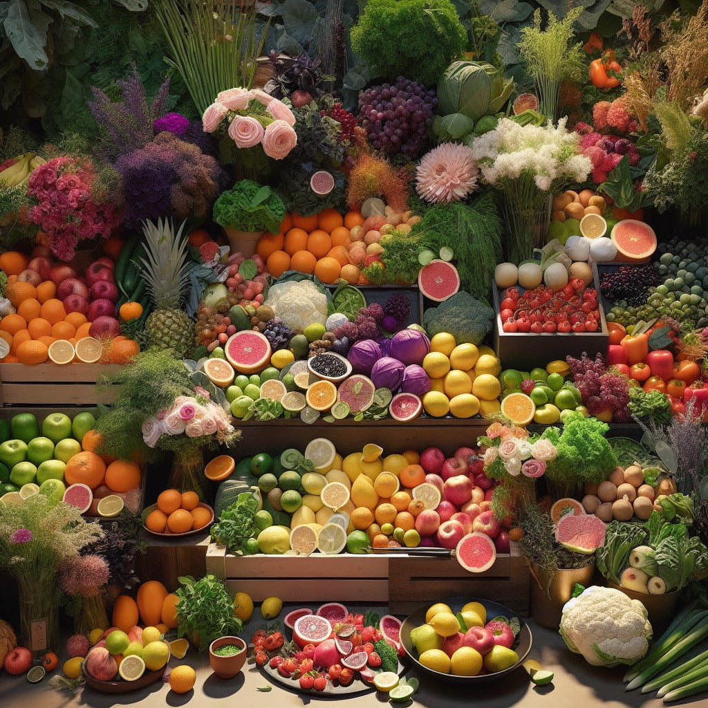
Harnessing the power of scent can transform a shopping experience. Fresh citrus, for example, can invigorate shoppers and encourage them to linger in the produce section.
To create this olfactory appeal, consider placing finely misted, fragrant oranges, lemons, and limes at nose level. Alternatively, a small display of aromatic herbs like basil and mint can serve a dual purpose—offering both visual appeal and a subtle, enticing aroma that can trigger the imagination of home-cooked meals, prompting customers to add more items to their baskets.
The trick lies in prioritizing freshness and avoiding overwhelming scents that might detract from the natural allure of high-quality produce.
DISPLAY PRODUCE IN THEIR NATURAL STATE
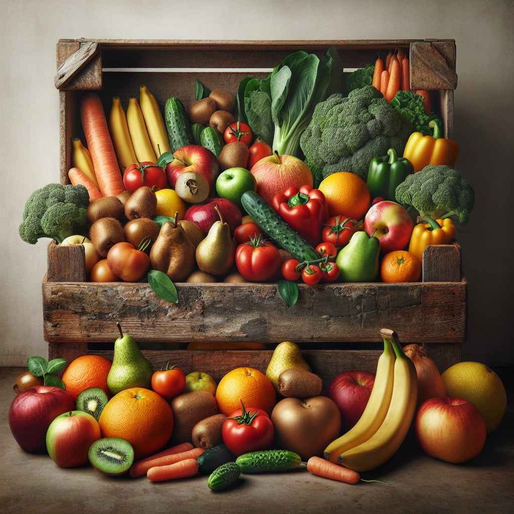
Providing customers with a sensory connection to the earthy roots of their food can enhance their shopping experience. When fruits and vegetables are presented with traces of soil on their skin or with leaves and stems attached, it conveys freshness and authenticity. This tactic often reminds shoppers of local farmers’ markets and can reinforce the quality of the produce.
Offer whole melons or pumpkins with portions of their vine still intact, or display root vegetables like carrots or beetroots with their tops on. This not only adds visual interest but suggests to the consumer that the products have been recently harvested. Moreover, keeping leafy greens in shallow water basins can signal vitality and prolong freshness.
Such displays should be accompanied by clear assurances that the produce has been responsibly and safely sourced, reassuring customers that what they are purchasing is both fresh and clean, despite its unpolished appearance. This natural presentation can create a more engaging and authentic shopping experience for consumers who value farm-to-table authenticity.
ARRANGE PRODUCE ALPHABETICALLY TO AID IN SEARCHING
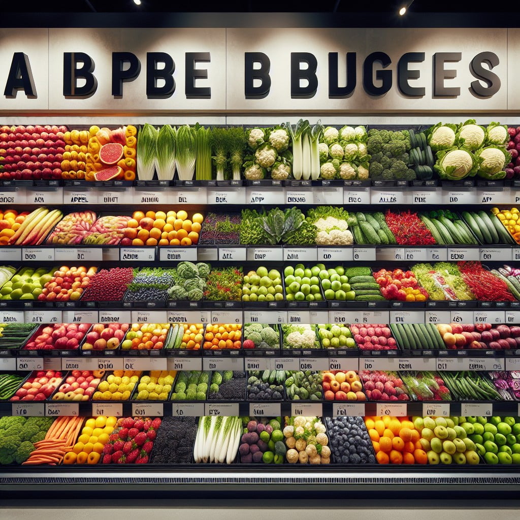
Organizing fruits and vegetables in alphabetical order streamlines the shopping experience for customers. This method leads to quicker identification and selection of items, saving time and reducing in-aisle confusion. Here’s how this approach can be beneficial:
- It creates a familiar structure, as consumers are often accustomed to alphabetical arrangements in various settings, such as libraries and directories.
- Customers looking for a specific item can easily navigate to the correct section without having to scan the entire display.
- It supports an efficient restocking process, as staff can quickly identify gaps and replenish missing items.
- Alphabetization helps in minimizing the touchpoints, as shoppers can directly reach for what they need, ensuring produce stays fresh longer by reducing unnecessary handling.
- This layout can also help to introduce customers to new produce they may not have previously considered, as they pass by other items on their way to their intended selection.
Applying this tactic can lead to an improved shopping experience, encouraging patrons to return, knowing they can find their produce with ease.
CATEGORIZE PRODUCE ACCORDING TO THEIR USAGE
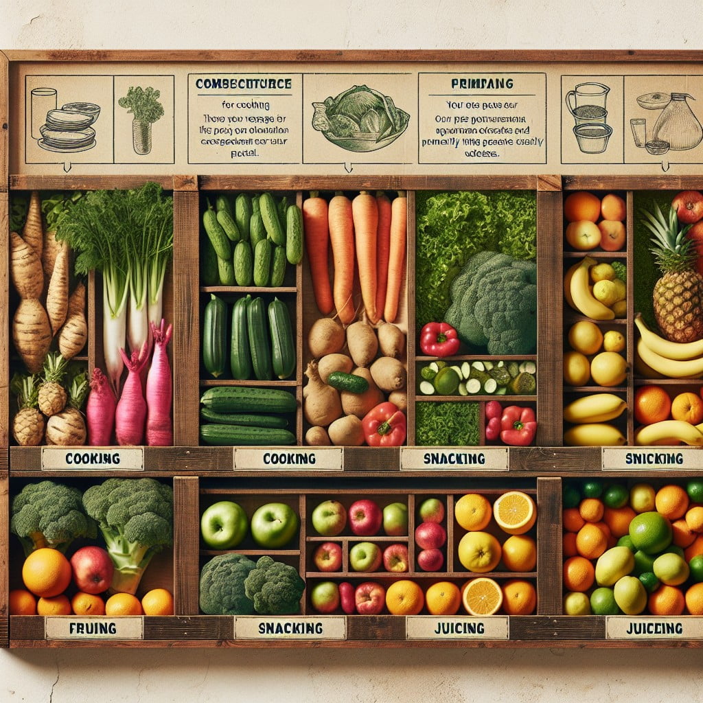
Organizing fruits and vegetables by how they’re typically used can streamline shopping for customers and enhance their experience. For example:
- Salad Station: Group leafy greens, tomatoes, cucumbers, and carrots together for shoppers looking to make fresh salads.
- Smoothie Ingredients: Place bananas, berries, apples, and kale near each other along with popular add-ins like ginger or turmeric.
- Soup Veggies: Cluster together ingredients commonly used in soups and broths, such as onions, celery, potatoes, and leeks.
- Stir-Fry Selections: Position peppers, bok choy, mushrooms, and snap peas in one section for easy access to those aiming to whip up a quick stir-fry dish.
- Baking Bunch: Put fruits typically used in pies and tarts like apples, pears, and rhubarb in a designated baking area.
By doing so, it provides a recipe inspiration, encourages the discovery of new produce, and potentially increases sales through the impulse buying of additional related ingredients.
DEFINE PATHS WITH LARGE PRODUCT VARIETIES
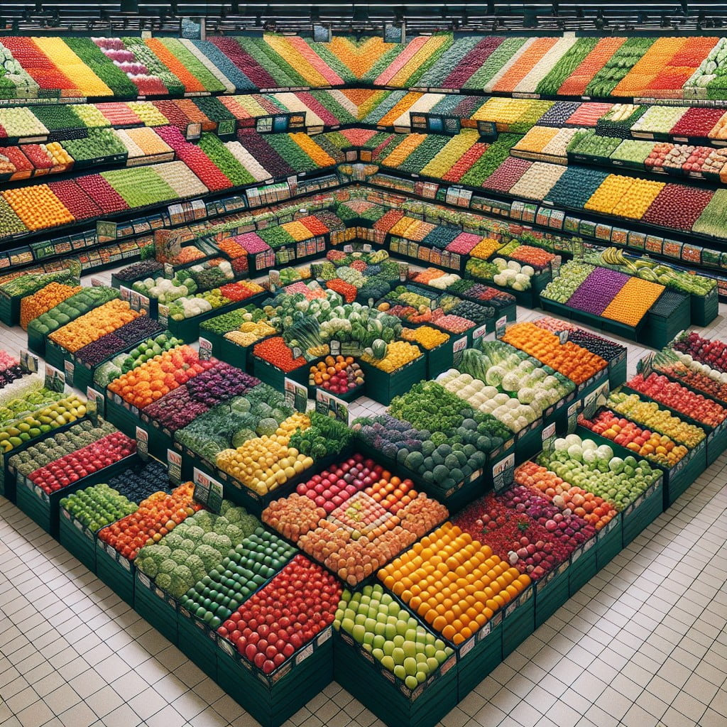
Crafting a seamless shopping experience entails guiding customers through the extensive selection of produce with ease. Here are some key points in designing defined paths within the display area:
- Utilize contrasting floor tiles or mats to visually demarcate walkways amidst the variety of fruits and vegetables.
- Place taller, more visually striking items at the ends of aisles to serve as landmarks, aiding in navigation.
- Clearly label sections with overhead signage to direct customers towards specific categories or items quickly.
- Implement subtle lighting differences to highlight pathways without overwhelming the senses.
- Arrange shelves and bins to create a natural flow that moves customers through the space, ensuring they encounter a wide assortment of products without confusion.
- Position best-selling or promotional items along the path to capture attention and encourage impulse purchases.
Remember, a well-planned path not only enhances shopping efficiency but also elevates the overall aesthetic appeal of the produce section.
INCORPORATE TACTILE EXPERIENCE IN DISPLAYS
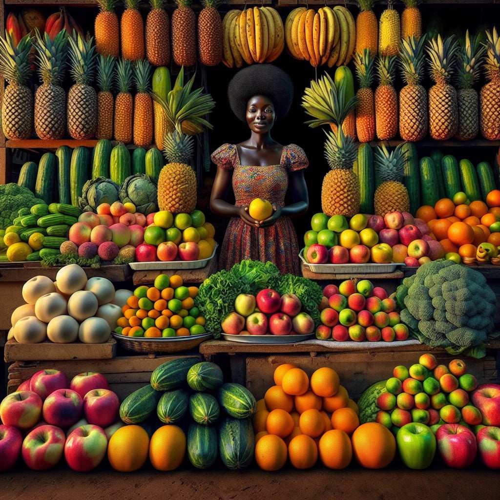
Customers often value the opportunity to touch and feel produce before purchasing. This sensory interaction can lead to increased customer satisfaction and sales. Consider the following to enhance the tactile experience:
- Offer sample fruits or vegetables out of their packaging, allowing shoppers to assess the texture and firmness.
- Display a diverse array of produce at varying stages of ripeness to cater to different preferences.
- Encourage customers to pick their own herbs from small, potted plants, which adds an interactive element.
- Design the space with wide aisles, giving customers ample room to navigate and handle products without feeling rushed.
- Keep the display areas within easy reach for all customers, including lower shelves for children and accessibility for those in wheelchairs.
Building a hands-on environment makes shopping more engaging, often leading to higher customer satisfaction and repeat visits.
CREATE A “FARMERS MARKET” SECTION IN STORE
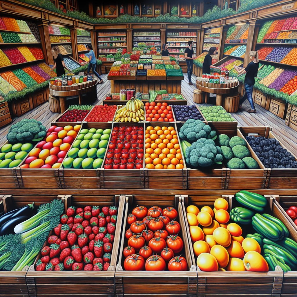
Emulating the charm of a farmers market within a grocery store can draw in customers who cherish the experience of shopping for locally-sourced and fresh produce. Here are several ways to achieve that ambience:
- Utilize rustic wooden bins and baskets to mimic the outdoor market feel.
- Feature signage in a handwritten font for a personal touch, indicating the local farms or origins of the produce.
- Group seasonal items together, spotlighting what’s currently being harvested in your region.
- Offer tastings of fresh produce when possible, allowing customers to experience the quality and flavor firsthand.
- Play up the community aspect by providing a bulletin board for local events, farm information, and seasonal recipes.
This approach not only supports local agriculture but also creates a shopping experience that resonates with the authenticity and community-oriented spirit of a true farmers market.
INTEGRATE QR CODES FOR EACH PRODUCE FOR ADDITIONAL INFORMATION
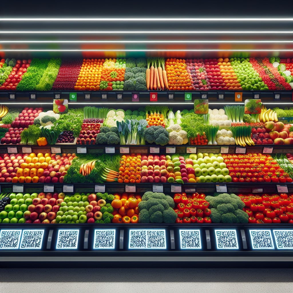
With QR codes attached to each type of produce, shoppers have instant access to detailed information with a quick scan using their smartphones. This innovative touch allows customers to learn about the origins of their food, farming practices used, and even recipes they can try at home.
QR codes essentially serve as digital storytellers, offering insights on nutritional content, potential health benefits, and storage tips to enhance shelf life. They also provide an educational component, enriching the shopping experience and empowering consumers to make informed choices about their diets.
By bridging the gap between technology and fresh food, these codes cater to the curiosity of the modern, health-conscious consumer.
Ideas Elsewhere
- https://www.hitchcockfarms.com/blog/produce-display-ideas
- https://marcocompany.com/blogs/news/5-amazing-produce-display-tricks-that-will-impress-customers-and-increase-sales
- https://www.thepacker.com/news/industry/building-produce-displays-make-impact
- https://kingrs.com/ourinsight/grocery-store-produce-department-design/
- https://www.dgsretail.com/resource-center/5-ideas-for-high-profit-grocery-and-cstore-produce-displays-/
- https://www.lemontreeproducts.com/how-to-display-produce-in-a-grocery-store/
- https://smallbusiness.chron.com/merchandise-produce-department-74299.html
Recap:
